
Talkable Improvement Updates: Enhanced Features

Improvement
2 years ago
Sorting Data in the Metrics Aggregation Report

Ksyusha Bespalova
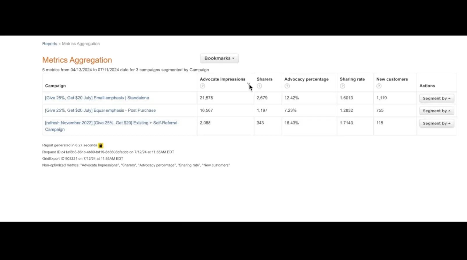
Problem: Previously, users found it challenging to manage and interpret data effectively in the Metrics Aggregation Report due to the lack of sorting functionality and the presence of pagination, which hindered a seamless data review process. Solution: We enhanced the user experienc...
Read more →
Improvement
Referral
2 years ago
Enhanced Date Range Grouping on Site Dashboard
Ksyusha Bespalova
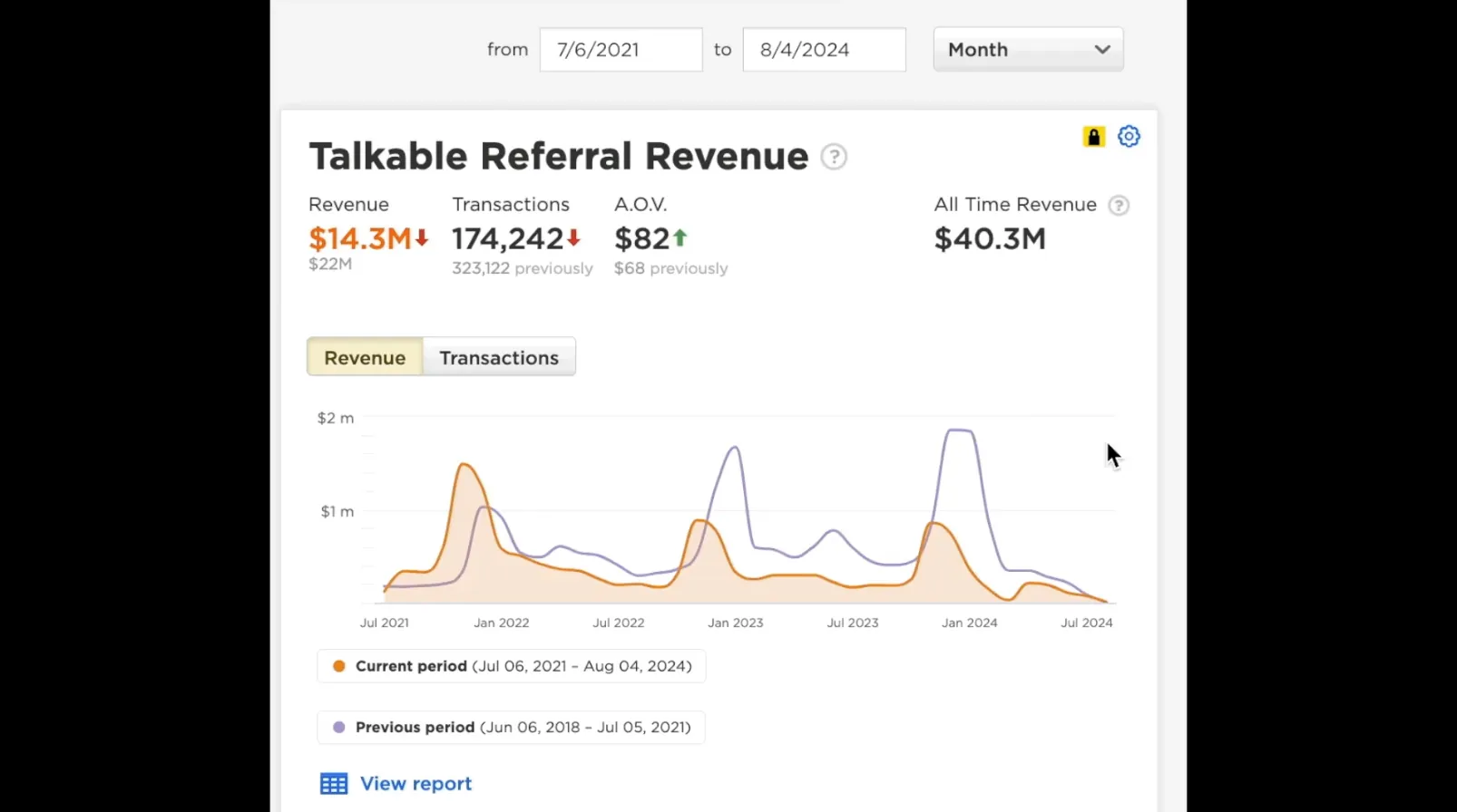
Problem: Users faced difficulties in effectively reviewing and analyzing program performance over different time frames. The existing system only allowed data viewing on a daily basis for selected periods, which limited comprehensive long-term analysis. Solution: To address this, we...
Read more →
Improvement
Referral
2 years ago
Placement Exclusion Update for Gleam Campaign
Ksyusha Bespalova
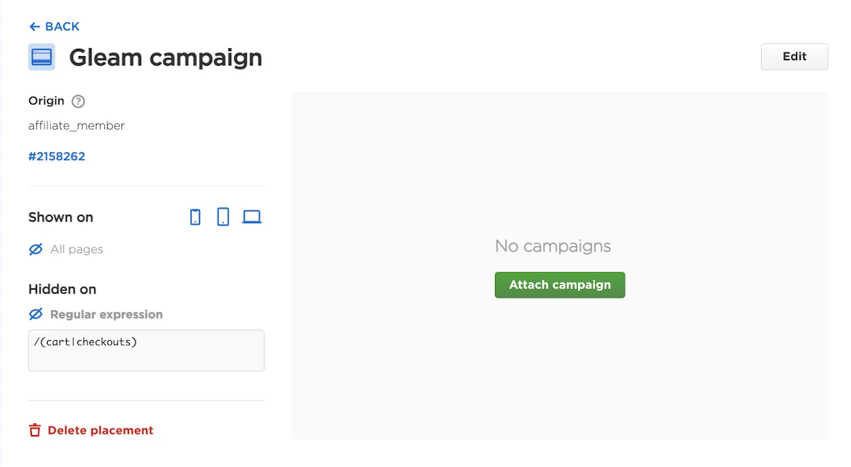
Problem: The Gleam placement previously lacked default exclusions, potentially leading to its visibility in areas where it may disrupt user experience, such as checkout or cart pages. Solution: We’ve implemented default exclusions for the Gleam placement, mirroring those alrea...
Read more →
Improvement
UI/UX Changes
2 years ago
Sticky Headers in Reports for Improved Data Viewing
Ksyusha Bespalova
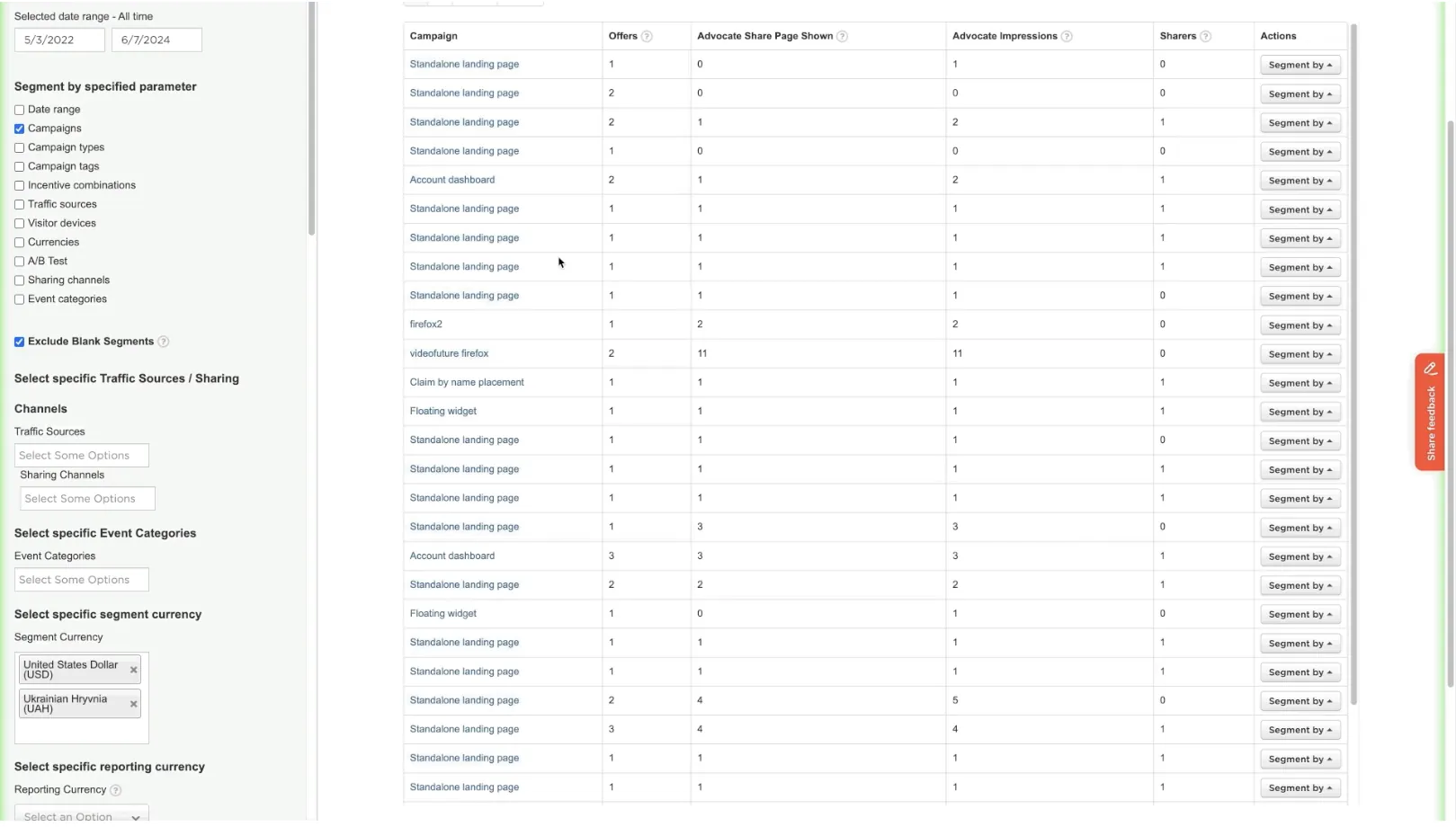
Problem: Navigating large datasets in our reports has proven cumbersome for users because the header row scrolls out of view. This makes it challenging to align data with the correct column headings, reducing the ease and efficiency of data interpretation. Solution: We implemented s...
Read more →
Improvement
UI/UX Changes
2 years ago
Standardize “View Report” Button Placement on Dashboard
Ksyusha Bespalova

Problem: The placement of the “View Report” button on Dashboard tiles was inconsistent, appearing in random locations across different tiles, which could confuse users. Solution: We have standardized the placement of the “View Report” button across all Dashbo...
Read more →