9 Shopify stores worth studying before you touch your own homepage
The best ecommerce sites make buying feel obvious. They help a shopper choose, build confidence before the checkout, and give people something worth telling a friend about. These nine stores all solve a different part of that job well.
There is no single “best Shopify store” template. A strong store can be spare and product-first, loud and community-led, or packed with education. What matters is whether the experience makes sense for the product and the customer.
This is a fresh 2026 list of Shopify brands to study. We chose them for practical reasons, not because their homepages happen to look good in a screenshot. Each example has a clear lesson you can take back to your own storefront.
What the best Shopify stores get right
| Job the page needs to do | What to look for | Why it matters |
|---|---|---|
| Make the offer clear | A shopper can explain the product and its main value in a few seconds. | Clarity beats cleverness when someone is deciding whether to keep scrolling. |
| Help people choose | Guides, filters, quizzes, bundles, reviews, or useful product comparisons. | Choice gets hard fast when products look similar or cost enough to create hesitation. |
| Make the brand memorable | Photography, a recognizable voice, and a point of view that carries through the journey. | That is what turns a purchase into a brand people bring up later. |
| Give customers a reason to return | Newness, replenishment, collections, content, or a useful post-purchase experience. | Acquisition is expensive. The second order is where the economics start looking better. |
Ruggable makes a high-consideration product easier to picture
Study this for: product education that does not feel like homework
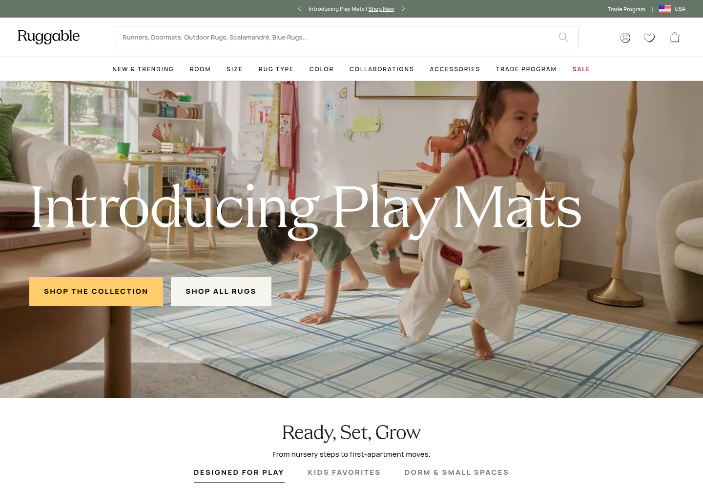
Rugs are a difficult online purchase. Size, material, color, cleaning, and the fact that the thing will sit in the middle of your room all create hesitation. Ruggable’s storefront meets that reality with room-led merchandising, lifestyle photography, and repeated reminders of the product’s washable construction.
The important part is the sequence. The site starts with an aspirational room, then gives the shopper a concrete reason the product works in real life. It does not lead with a long feature list and hope the customer connects the dots.
Gymshark sells a feeling before it sells a pair of leggings
Study this for: community energy with a clear shopping path
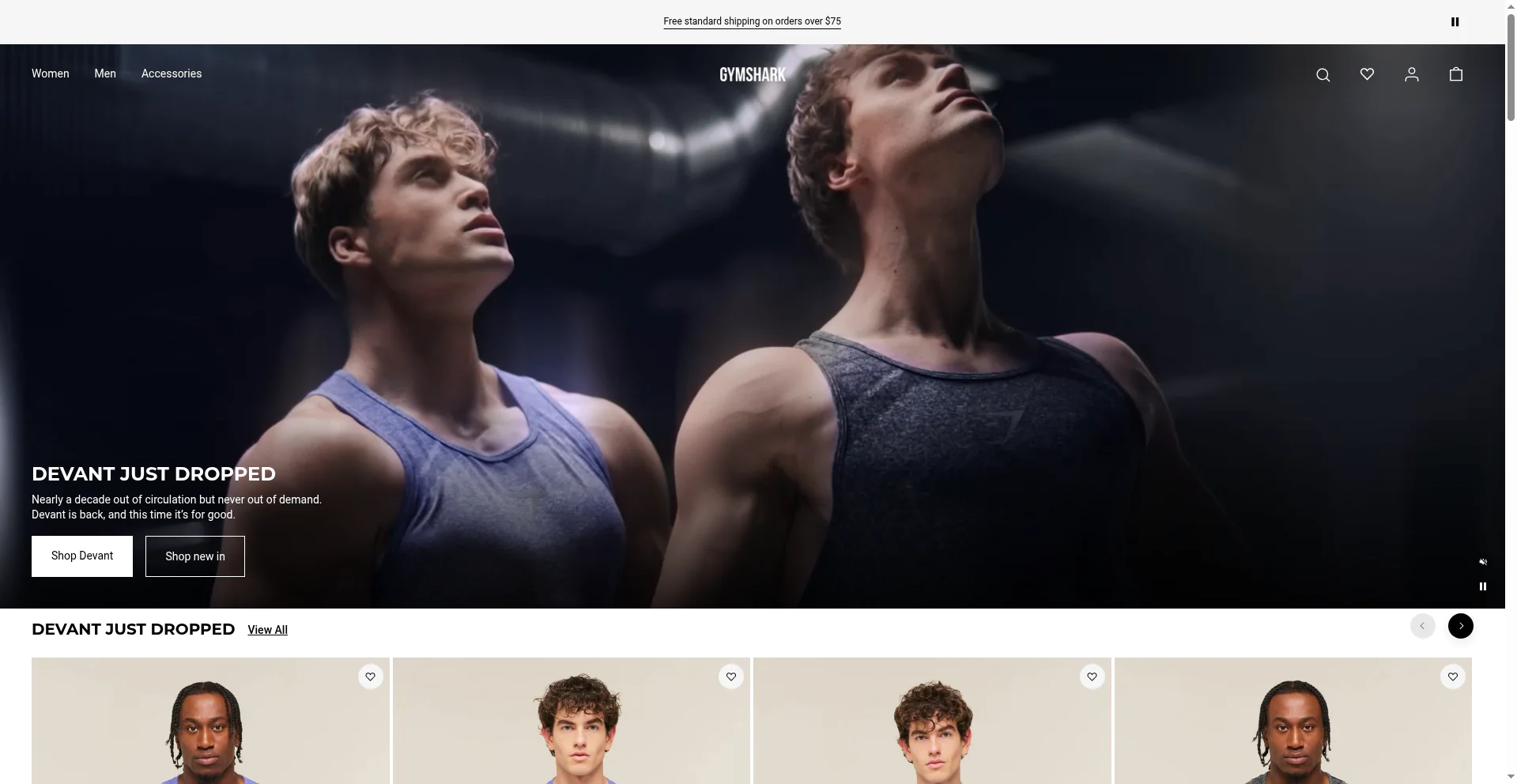
Gymshark has always understood that its customer is buying more than performance apparel. The storefront keeps that energy visible through strong talent, movement, campaigns, and a fast route into the category a shopper came for.
The page does not make the customer choose between brand and commerce. Editorial campaign content sits beside direct paths to women’s, men’s, new arrivals, and sale. It is a good reminder that personality does not have to slow a storefront down.
Allbirds turns material science into a shopper-friendly story
Study this for: sustainability claims with a real product role
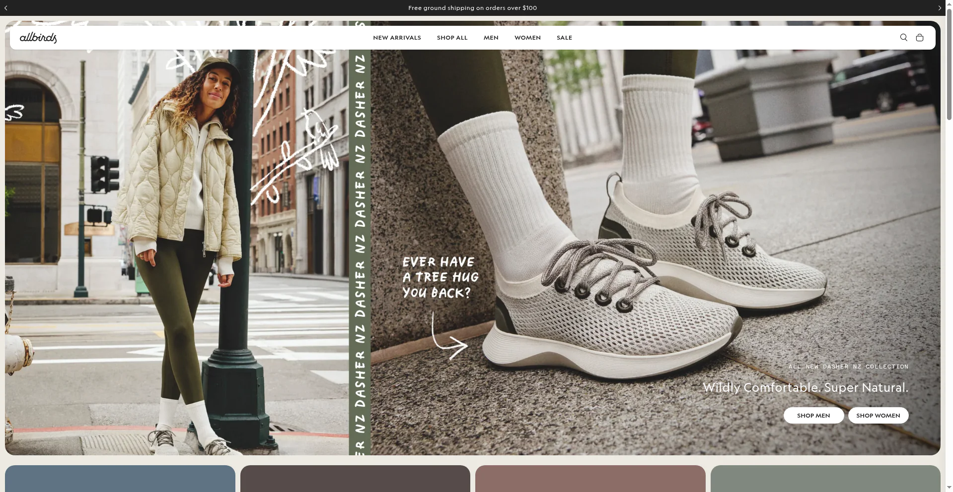
Allbirds is known for a clean visual system, but its better trick is the way it makes material choices part of the purchase decision. The shoes are still the hero. The natural materials and lower-impact story give the customer a reason to care about them.
That balance matters. Sustainability language can become wallpaper when it is disconnected from performance, comfort, or design. Allbirds keeps it close to the product, where it can support the sale instead of competing with it.
KITSCH makes small, giftable products feel collectible
Study this for: merchandising frequent newness without chaos
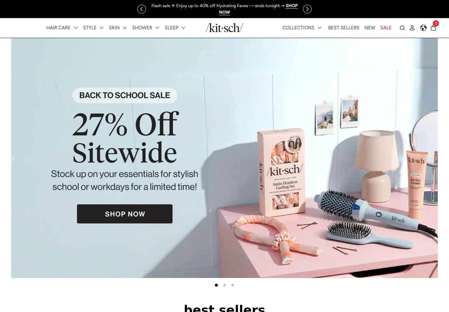
KITSCH has a broad catalog, plenty of collaborations, and products that can easily become an impulse add-on. The site handles that with recognizable color, playful product photography, and collection-led routes that make browsing feel productive rather than random.
There is a useful lesson here for brands with lots of SKUs. You do not need to show every product at once. Give people a reason to enter through a collection, a trend, or a problem they are trying to solve.
TASCHEN lets the product’s point of view do the selling
Study this for: premium editorial commerce
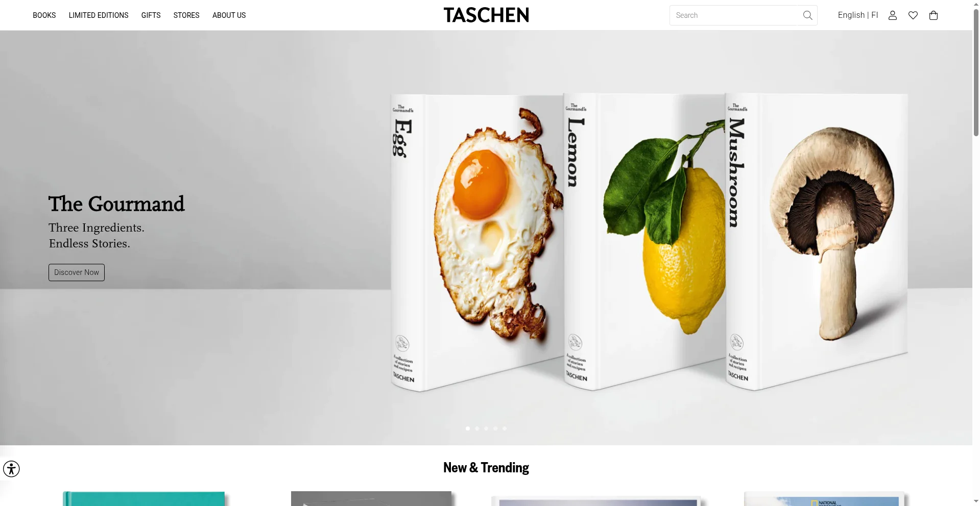
TASCHEN sells books that are objects in their own right. Its storefront respects that. Large imagery, confident typography, and space around the products make the experience feel closer to browsing a well-curated art bookshop than clicking through a standard catalog.
It is a good counterpoint to the idea that every ecommerce page needs to cram in badges and promotions. If the product carries visual weight, restraint can create more value than noise.
Jungalow proves pattern can be a navigation system
Study this for: a distinct brand that still converts
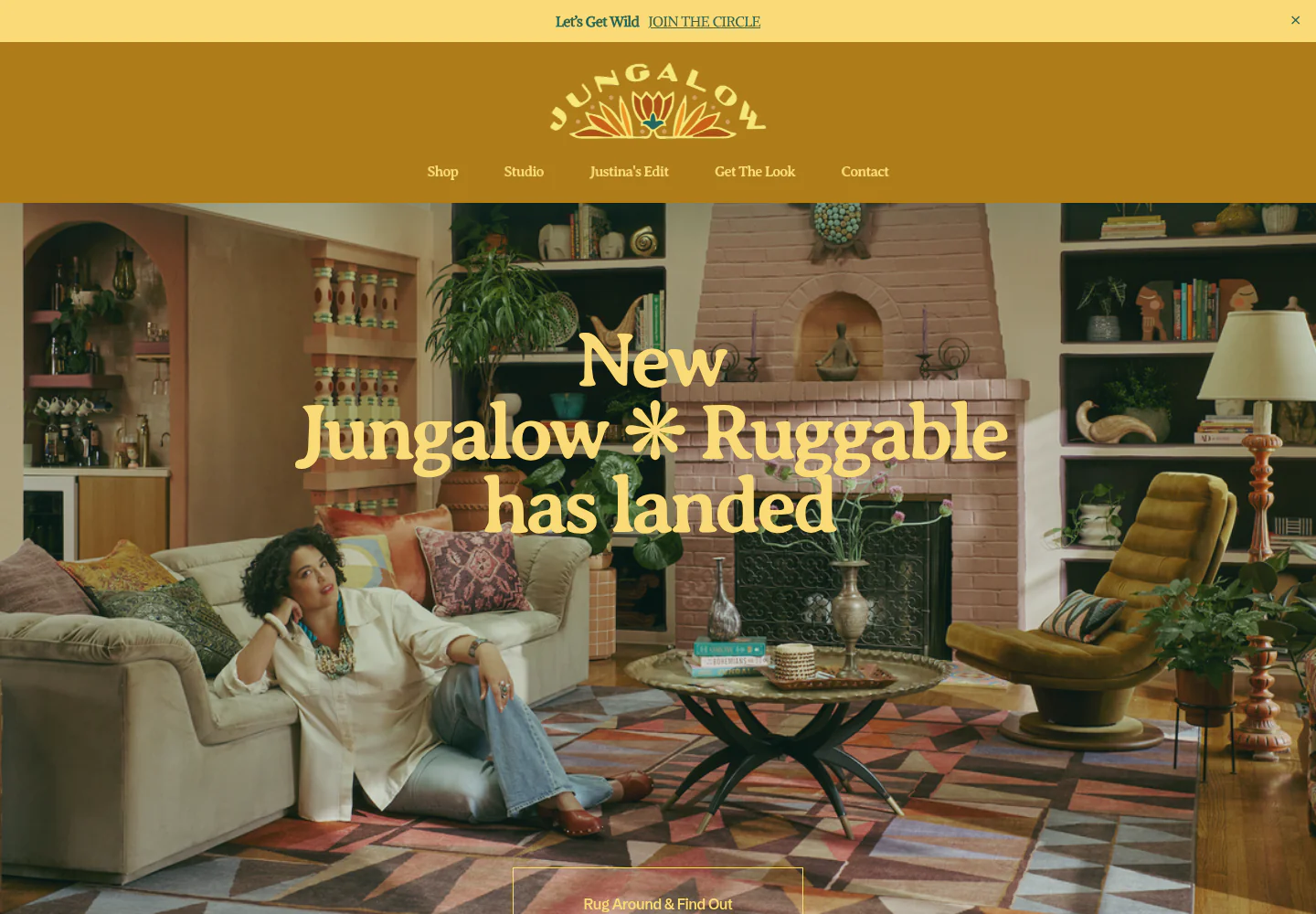
Jungalow’s point of view is impossible to miss. Pattern, color, illustration, and interior scenes make the shopping experience feel owned rather than assembled from a theme. Still, the product categories remain legible and the site gives shoppers practical routes into the catalog.
That is the bit worth studying. A branded world is not the same thing as visual clutter. The best version gives customers a strong feeling while preserving the basic usability of a store.
Beardbrand uses education to make grooming less intimidating
Study this for: content that helps a customer buy with confidence
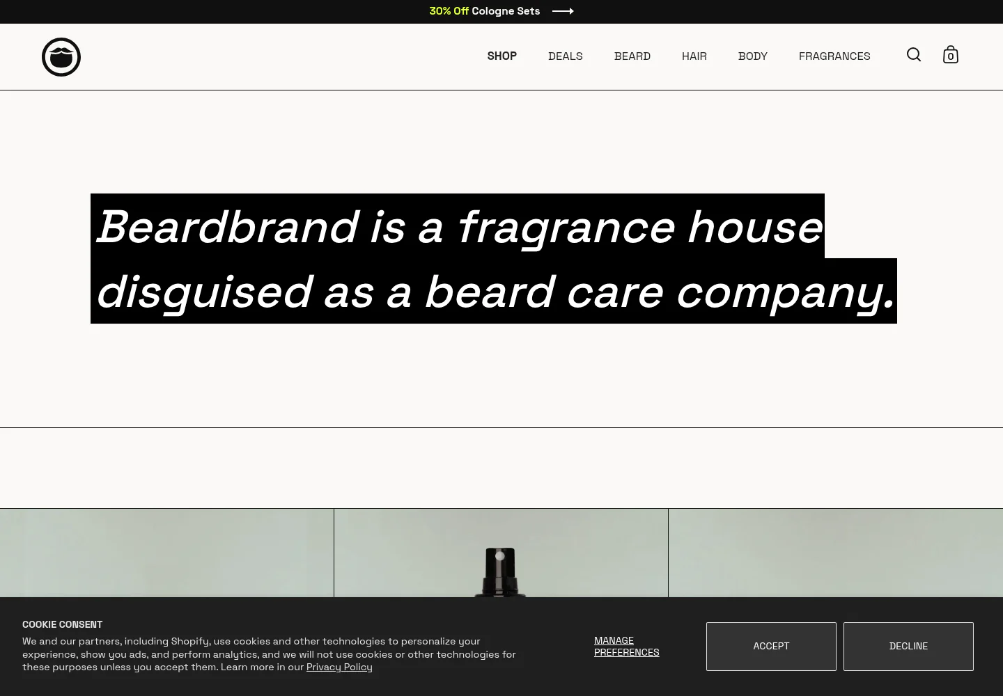
Grooming can create a surprising amount of friction. What does a product do? Which scent fits? What is the right order to use it in? Beardbrand’s store and content ecosystem answer those questions in a direct, unfussy voice.
That makes the commerce experience feel more helpful than salesy. The brand does not assume every visitor already knows the category language. It meets customers where they are and gives them a better reason to return once they do.
Our Place makes cookware feel like a lifestyle choice, not a hardware spec
Study this for: editorial merchandising that keeps the purchase path clear
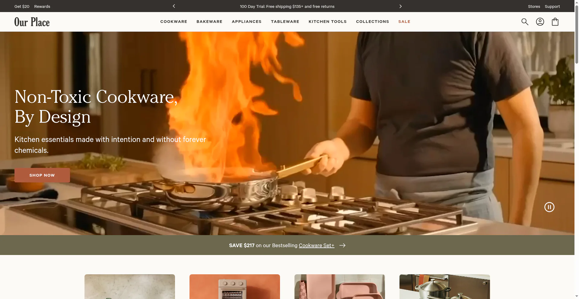
Our Place uses the homepage like a magazine spread, but it does not lose sight of the product. The visual world is warm and aspirational. Categories, savings, and the fastest routes into the cookware range remain visible the whole time.
That balance is worth studying. A narrow product line can still feel rich when the brand shows it in real homes, gives it a point of view, and explains what makes it different without turning every screen into a spec sheet.
Kosas gives shoppers a better way into a complicated beauty category
Study this for: guided discovery that does not make the customer work for it
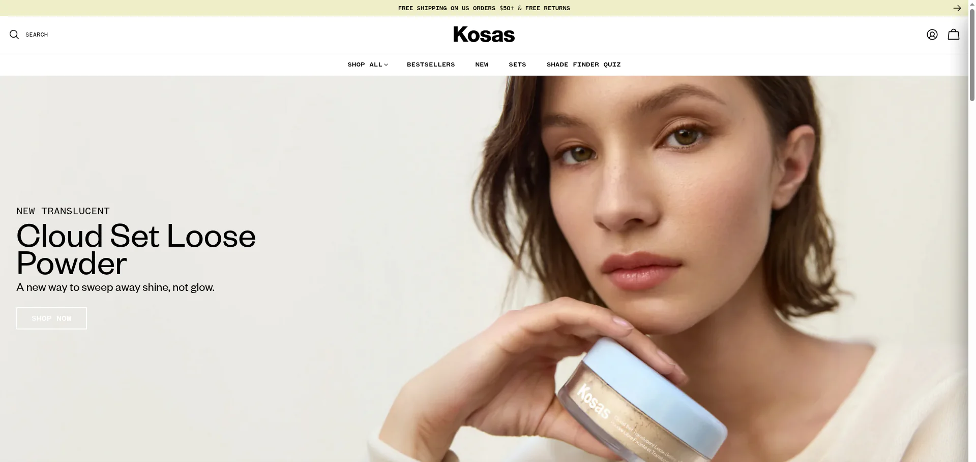
Beauty stores can overwhelm a first-time shopper with shades, finishes, routines, and unfamiliar product names. Kosas keeps the visual presentation clean, while a clear shade finder and quiz give people an easy way to narrow the field.
It is a small but meaningful shift. The site does not ask visitors to become makeup experts before they can buy. It gives them a useful next step, which is often more convincing than another discount banner.
Build something customers want to pass on
The strongest Shopify stores do more than get a customer across the checkout. They make the product easy to understand, easy to talk about, and worth coming back to. That is also the foundation of a referral program that does not feel bolted on after the fact.
Read Talkable’s referral marketing guide to see how brands turn those customer moments into new acquisition.