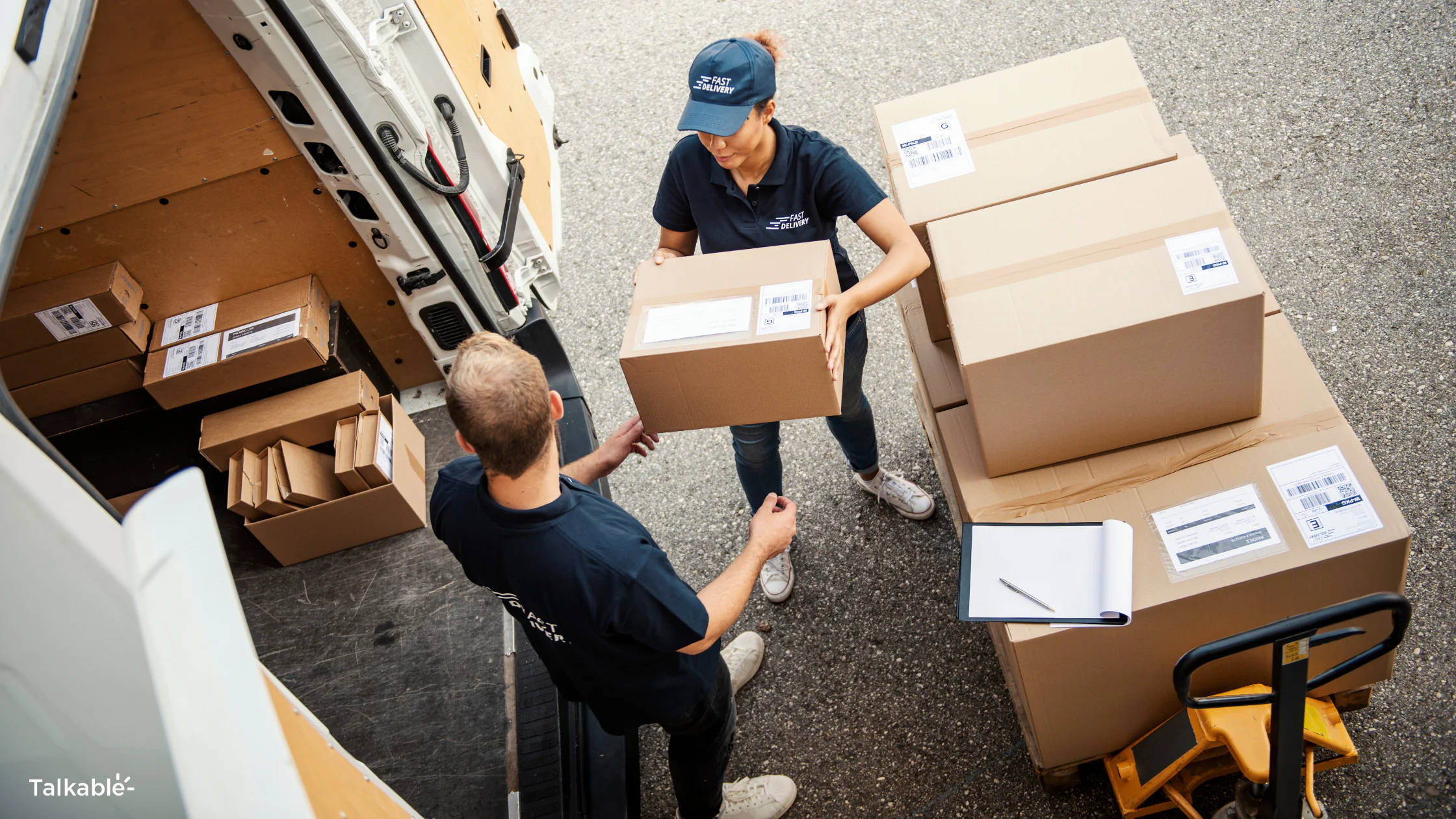
Every ecommerce brand obsesses over getting someone to checkout. The ads. The retargeting. The abandoned cart emails. Millions of dollars spent pulling people through the funnel toward that one magic moment: the purchase.
And then what happens? A page loads that says “Thank you for your order!” with a confirmation number and maybe a sad little cross-sell widget nobody clicks. The most engaged, most emotionally primed moment in your entire customer relationship, and you fill it with… nothing.
I’ve audited hundreds of ecommerce sites over the past decade, and this pattern repeats everywhere. Brands will spend $50,000 a month on Meta ads to drive traffic, then serve a confirmation page that cost $0 in strategic thought. It’s like spending a fortune on a first date and then ghosting before dessert.
Why this moment matters more than you think
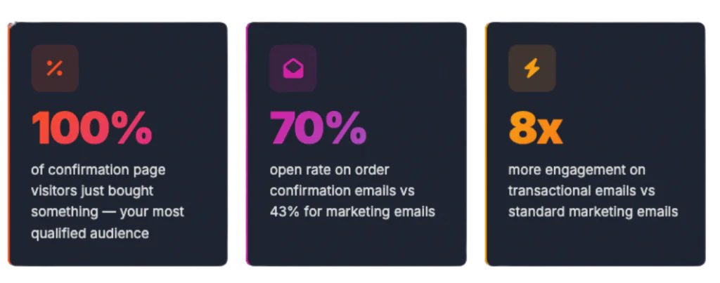
Your order confirmation page has something no other page on your site can claim: 100% of the people viewing it just gave you money.
Think about that for a second. This isn’t top-of-funnel traffic that might bounce. These aren’t email subscribers who may or may not open. These are people who pulled out their credit card, typed in their digits, and hit “Place Order.” They are maximally committed to your brand in that moment.
And the data backs it up. Order confirmation emails hit open rates of 65-70%, compared to the 43% average for marketing emails. That’s not a small gap. Transactional emails get 8x more opens and clicks than regular marketing emails. You’re getting attention here that money literally cannot buy elsewhere.
Yet here’s what keeps getting to me: the same marketing team that will A/B test a button color on a landing page for six weeks won’t spend 30 minutes thinking about what happens after checkout. The confirmation page sits there, untouched, doing the bare minimum. Meanwhile, the customer’s emotional high is ticking down with every second you waste it.
What most confirmation pages actually look like
Pull up your own confirmation page right now. I’ll wait.
If you’re like 90% of the brands I’ve seen, here’s what’s on it:
- A “Thank you for your order!” headline
- An order number
- A list of items purchased
- Shipping address
- Maybe a “Continue Shopping” button that nobody clicks
That’s it. That’s the whole strategy. You just got someone to spend $85 on your product, they’re sitting there feeling good about it, and the best you can offer them is a receipt.
The confirmation page is the most valuable piece of real estate in ecommerce, and most brands treat it like a parking lot.
Shopify’s default confirmation page is a perfect example. It does exactly what it needs to do, functionally. But it doesn’t do anything strategically. And most brands never customize it beyond swapping in their logo.
Compare that to what’s possible. Some brands are generating $500K+ in additional annual revenue from their confirmation page alone. The difference isn’t budget or technology. It’s intent.
Five things your confirmation page should be doing
If your confirmation page is just confirming the order, it’s working at maybe 20% of its potential. Here’s what the other 80% looks like.
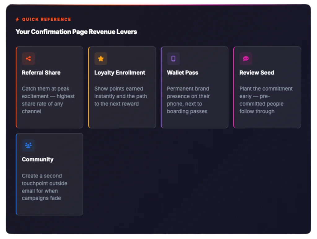
1. Trigger a referral while the excitement is fresh
The seconds after purchase are the single best time to ask a customer to share. Not tomorrow. Not in a follow-up email three days later. Right now, while they’re still feeling the dopamine hit of buying something they wanted.
This isn’t theory. At Talkable, we’ve seen post-purchase referral placements outperform every other placement type. When someone just bought a pair of sneakers they’re excited about, “Your friend gets $20 off, you get $20” feels like passing along a genuine favor, not a marketing ask.
The mechanics matter, though. One-click sharing is non-negotiable. If someone has to copy a link, open their messaging app, and paste it manually, you’ve already lost 80% of them. Pre-populated share messages, direct links to text/email/social, and a clean visual that doesn’t compete with the order details. That’s the formula.
2. Enroll them in your loyalty program
If you run a loyalty program and you’re not enrolling people on the confirmation page, I need to understand why. This is someone who literally just proved they’ll buy from you. They have purchase intent, brand affinity, and an active session all at the same time.
The best approach I’ve seen: show them the points they just earned from this purchase, with a clear progress bar toward their first reward. “You just earned 85 points! Only 115 more to unlock free shipping on your next order.” That immediate feedback loop is what turns a one-time buyer into a repeat customer.
Some brands take it further and tie the loyalty enrollment to the referral ask. Share with a friend, earn bonus points. Now you’ve got two retention mechanisms firing from one page.
3. Get a wallet pass onto their phone
Here’s something that keeps surprising me. Wallet passes – Apple Wallet and Google Wallet – have near-zero adoption in ecommerce, but the brands using them are seeing outsized results. A wallet pass puts your brand, your referral link, and your loyalty balance on the customer’s phone permanently. Not buried in an inbox. Not behind an app download. Right there next to their boarding passes and concert tickets.
The confirmation page is the ideal place to prompt a wallet save because the customer is already on their phone (over 70% of ecommerce transactions are mobile) and they’re in “save this for later” mode. They just bought something, so mentally they’re already filing away information about this purchase. Sliding your wallet pass into that moment feels natural rather than intrusive.
4. Capture a review commitment
You’re not going to get a product review on the confirmation page. They haven’t received the product yet. But you can plant the seed.
“We’d love to hear what you think once your order arrives. We’ll send you a quick email when it’s delivered.” That simple prompt does two things: it sets an expectation they’ll hear from you again (which improves open rates on future emails), and it pre-commits them psychologically to leaving a review. People who agree to do something in advance are significantly more likely to follow through when the moment comes.
5. Build a community connection
Depending on your brand, the confirmation page can be a gateway to community. This works especially well for lifestyle brands, fitness brands, and anything with a strong identity component.
An invite to join your private Facebook group, follow a branded hashtag, or download your app. Keep it to one ask, not four. The goal is to create a second touchpoint outside of email so that when the inevitable inbox noise drowns out your next campaign, you still have a way to reach them.
The confirmation email: your second shot at this
If the confirmation page is the first swing, the confirmation email is the follow-through. And it comes with its own set of advantages.
That 70% open rate I mentioned? It’s real, and it’s consistent across industries. But here’s what makes it especially valuable: people don’t just open confirmation emails once. They open them an average of 2-3 times – first to confirm the order went through, then to check shipping details, sometimes again to reference the order number when the package arrives. Each open is another chance for your secondary content to register.
The brands doing this well treat the confirmation email like a mini landing page. Order details up top (that’s what the customer came for, don’t bury it), then a clear, well-designed block underneath with their referral offer or loyalty enrollment. No walls of text. No five different CTAs competing for attention. One primary action beyond “track your order.”
People open confirmation emails 2-3 times on average. Each open is a revenue opportunity most brands are ignoring.
What the best brands do differently
After working with 250+ ecommerce brands at Talkable, patterns emerge. The brands that generate real revenue from post-purchase moments share a few traits.
They treat the confirmation page as a product, not a receipt. It has an owner on the team. It gets A/B tested. It has KPIs beyond “did the confirmation load.” The best ones track referral share rate, loyalty enrollment rate, and wallet pass save rate as first-class metrics alongside their acquisition numbers.
They match the energy of the moment. Right after purchase, the customer is excited. The confirmation page should reflect that energy. Congratulatory copy. Product imagery. A feeling of “you made a great choice” before any ask. The brands that lead with a referral widget before even acknowledging the purchase miss the emotional beat entirely.
They don’t try to do everything. I’ve seen confirmation pages with six different CTAs, a survey, a referral offer, a loyalty enrollment, a newsletter signup, a social follow, and an app download. It’s chaos. Pick two. Maybe three if you’ve got the real estate. Your referral offer and loyalty enrollment can coexist. Beyond that, you’re just creating decision paralysis.
How to fix yours this week
This doesn’t require a redesign or a six-month roadmap. You can start generating revenue from your confirmation page in days, not quarters.
Day 1: Audit what you have. Open your confirmation page in a browser and your confirmation email in your inbox. Screenshot both. Write down everything that’s on them. Now write down everything that’s missing. That gap between the two lists is your opportunity.
Day 2-3: Add a referral placement. If you’re on Talkable, this is a configuration change, not a development sprint. A post-purchase overlay or inline referral widget can be live by end of day. If you’re not on Talkable, we should talk – but even a basic “share this link” CTA is better than nothing.
Day 4-5: Optimize your confirmation email. Add a secondary content block below the order details. A referral offer, a loyalty enrollment, or even just a link to your top-performing content. Remember: this email gets opened 2-3 times. Whatever you put here gets multiple impressions for free.
Day 6-7: Set up tracking. If you can’t measure referral clicks, loyalty enrollments, or wallet saves from your confirmation page, you can’t optimize it. Set up event tracking for every CTA. This is the baseline that makes everything else possible.
The brands generating millions from their confirmation page aren’t doing anything complicated. They’re just doing something, period – while everyone else serves a receipt.
The math that makes this obvious
Let’s make this concrete. Say you process 10,000 orders per month with a $90 average order value. That’s $900,000 in monthly revenue.
If 5% of those customers share a referral from your confirmation page (a realistic number for an optimized placement), that’s 500 shares per month. If each share converts at even 10% (conservative for referred traffic), you’re adding 50 new customers per month from a page that already exists and costs nothing in media spend.
At $90 AOV, that’s $4,500 per month in new revenue – $54,000 per year – from a page you weren’t even using. And that’s before factoring in that referred customers have 16-25% higher lifetime value than customers acquired through paid channels.
Now layer in loyalty enrollment (higher repeat purchase rates), wallet passes (persistent brand presence on their phone), and review generation (social proof that lifts conversion sitewide). The compounding effect turns your confirmation page from a dead end into a growth engine.
The post-purchase confirmation page is the most overlooked revenue opportunity in ecommerce. Not because the data is hidden, or because the technology doesn’t exist. But because most teams categorize it as “transactional” and never go back to question that assumption.
Your confirmation page gets more qualified attention than any page on your site. The only question is whether you’re going to use it.
About the Author
Jeremy Foreshew is Head of Marketing at Talkable. He works with DTC and ecommerce brands on referral strategy, retention, and customer-led growth. He has been featured in Forbes, TechCrunch, and HuffPost.