
Talkable UI/UX Updates: Better Usability

UI/UX Changes
1 year ago
Redesigned Transactions Distribution Tile: Clearer Customer Revenue Insights

Ksyusha Bespalova
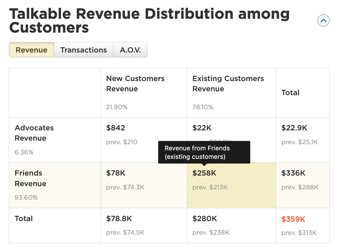
We’ve listened to your feedback and made big improvements to the “Talkable Transactions Distribution among Customers” tile on your dashboard. Our updated design focuses on clarity and transparency. Here’s what’s new: Each key metric — including AOV — now comes with a hel...
Read more →
UI/UX Changes
1 year ago
Introducing Minimalistic Theme for Efficient Campaign Design
Ksyusha Bespalova

In response to client feedback and a clear preference for simpler, more aesthetic designs, we’re announcing a major update to our campaign design process. Previously, achieving a minimalistic look required extensive manual configuration and significant time investment. We are now st...
Read more →
Improvement
UI/UX Changes
2 years ago
Sticky Headers in Reports for Improved Data Viewing
Ksyusha Bespalova
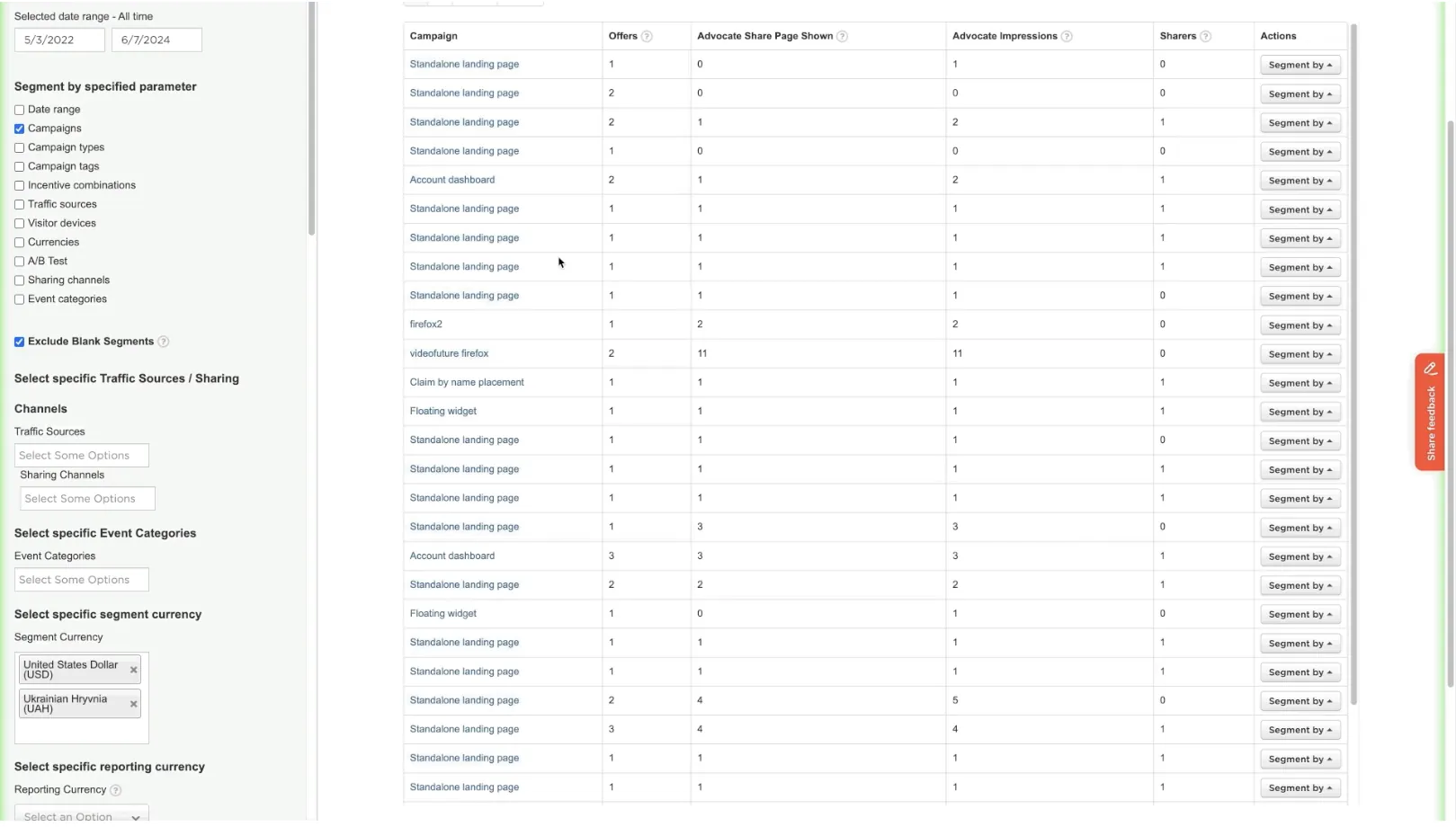
Problem: Navigating large datasets in our reports has proven cumbersome for users because the header row scrolls out of view. This makes it challenging to align data with the correct column headings, reducing the ease and efficiency of data interpretation. Solution: We implemented s...
Read more →
Improvement
UI/UX Changes
2 years ago
Standardize “View Report” Button Placement on Dashboard
Ksyusha Bespalova

Problem: The placement of the “View Report” button on Dashboard tiles was inconsistent, appearing in random locations across different tiles, which could confuse users. Solution: We have standardized the placement of the “View Report” button across all Dashbo...
Read more →
Improvement
UI/UX Changes
2 years ago
Upload Files With Identical Names
Ksyusha Bespalova
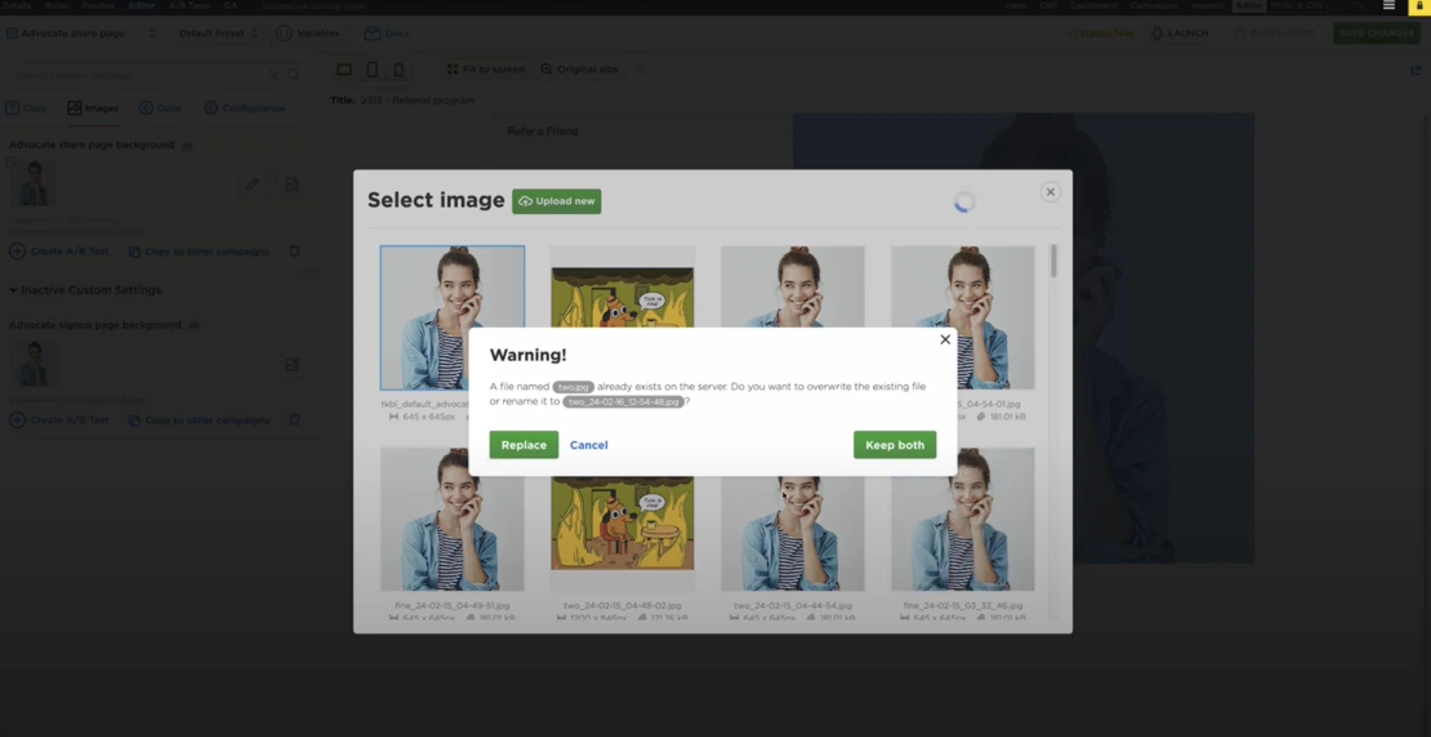
To improve the user experience in file management, we’re updating the file upload functionality to accommodate files with identical names. Currently, users face a limitation where uploading a file with the same name as an existing file prompts only an option to replace the exist...
Read more →