
What’s New

New Feature
Referral
1 year ago
Introducing SMS Phone Verification for More Secure Referral Campaigns

Ksyusha Bespalova

Security and trust are the foundation of successful referral marketing, and we’re thrilled to introduce our latest enhancement to support this: SMS-based phone verification. This new feature is now available in Campaign Rules, giving your team the ability to require phone number...
Read more →
Improvement
1 year ago
New Default Templates for Advocate and Friend Custom Emails
Ksyusha Bespalova

We’re removing friction from email customization and putting more power into the hands of your marketing team. With our latest update, default templates are now available for Advocate and Friend custom emails, making it easier than ever to launch referral campaigns with professional...
Read more →
Improvement
1 year ago
Smarter Reporting: Expanded Identifier Filters and Clearer Opt-In Labels
Ksyusha Bespalova
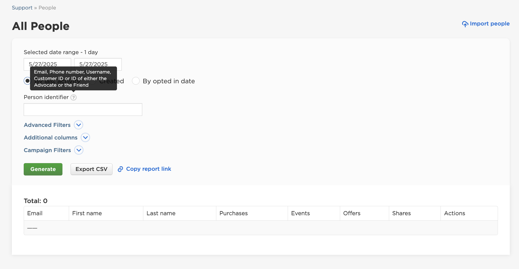
We’re making it easier than ever to work with data across Talkable reports. With the rise of phone number-based user identification and more flexible customer IDs, our latest reporting update ensures that your team can filter, search, and interpret data with greater clarity and ...
Read more →
Improvement
Referral
1 year ago
New Referrals Report Enhancements: Control over Manual Approvals
Ksyusha Bespalova
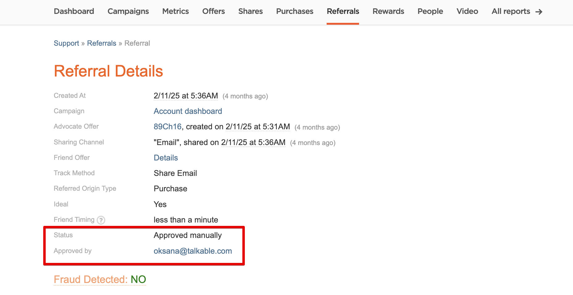
We’re excited to roll out a powerful update to the Referrals Report that gives our clients more clarity and control. With this enhancement, the report now clearly indicates when a referral has been manually approved or voided — and most importantly, by whom. Previously, it was dif...
Read more →
Staff Feature
1 year ago
Proactive Campaign Monitoring: New Staff Alerts for Low Coupon Redemptions
Ksyusha Bespalova

We’ve launched a new notification feature designed to help teams quickly detect and respond to potential campaign or integration issues. This update introduces automated staff alerts when no coupon redemptions are detected for Friends or Advocates over a set number of days. Previous...
Read more →